
Here is the beginning of Phase Two for my Japanese embroidery class. I love this design. Soon I will be working with more goldwork which is gorgeous!!!!


 Far left fabric is a sandwich of light blue nylon tulle sprinkled with Bo-nash powder with small scraps from my paper cutting exercises. I didn't like the white spots created when the bonding powder melted so I took some gold foil and foiled the piece too.
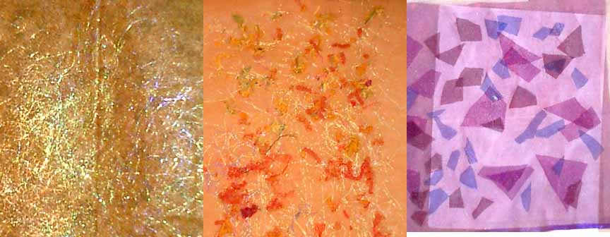 The far left piece is a commercial print fabric with angelina fused with wonderunder. I then addded a layer of sheer on top.
 Here is a set of my painted fabric. I really like working with tone on tone and realized that the majority of my fabric was orange/yellow on orange/yellow or blue/purple on blue/purple! I made several new fabrics with the compliments. I really liked them.

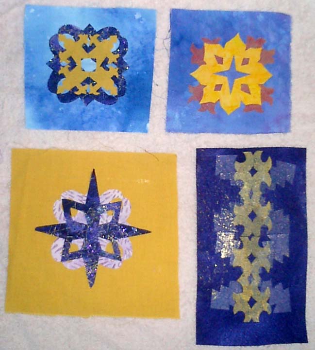
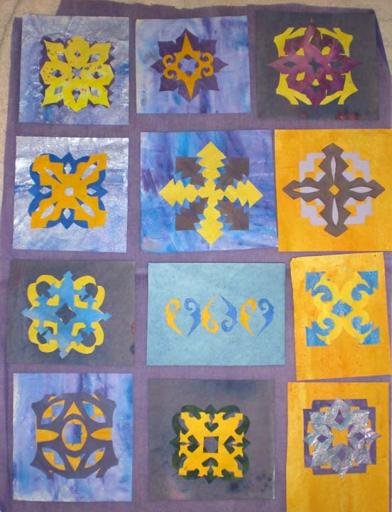 Here is another set of my paired designs. I really do like them. I think the biggest weakness is that there isn't a lot of visual variations between the designs. They are all, except for third row middle, a centered motif, similar to a quilt square. As I develop designs, I really want to find ways to integrate the entire space. On the stitched sample that I worked on this weekend, I began to work with the background more to make it more of a part of the design, not just a pretty pattern slapped onto any old background. Suggestions???


 This is set one of my cut-out shapes. I really enjoyed this, but of course didn't read the directions well! These designs are only 2 inch square. A friend (Cathy) pointed out to me that they should be 4 inches, which was a lot easier!!!!! I scanned them into photshop and enlarged them for later use. The middle design on the right page came apart when I unfolded it. To me this was a very happy accident. I loved the little shape that was created and actually cut another stamp of this design which I used to stamp fabric.
 Sketchbook pages showiing design development. Most of these designs were developed with graph paper, tracing paper and photoshop!
 These are some of the repeat patterns from photoshop for Design Sheet C: Pattern with New Design Unit
 These are some of the photoshop designs. On the left is scale as well as using a repeat to turn a corner. I liked the softer border created by the curves. On the right is the Repeat Pattern from a new Shape (Star in a Triangle) from Design sheet A.
 Design Sheet C

 Design Sheet A
 Here is the collection of my painted papers as well as a few of my purchased papers from my stash. I am going for a royal blue/purple and an orange/yellow. I had a hard time getting the right purple. I wanted a blue purple, but the color kept getting too magenta. In the end, I think I created enough blue-purples to work with for the these exercises.


 Here are two different ways that I did my worksheets. Both are directly from my sketchbook. The one on the bottom, contains my notes from my paper painting exercise. It is messy and although I can read it, I am not sure if anyone else would find it that useful. On the top is a page from my sketchbook as I worked up ideas to design my stamps. It is much more controlled and "pretty", but I question, if I could achieve that if I were working fast and messy. There would be times when I would have to work in my sketchbook and then create a notes page/worksheet from these notes. Which is correct or what recommendations on creating the worksheets do you have as I go forward?
 These were actually my first cut outs and to me, the least exciting. The only one that I really find interesting is the one on the lower left, which is three stars layered and at angles to the previous layer. I varied the line thickness for additional interest. It does create some interesting negative shapes inside the stars. The flower star in the upper left corner was created using a cuttle bug and a purchased die cut that I owned. This sheet is also 9 by 12 inches.
 Here is another set of paper cut outs. The background paper is a store bought washi paper with gold threads embedded. It measures 8 inches by 11 inches. I like several of these designs. My least favorite is the upper far right design. It is just too "common" as compared to the others. The cherry blossom on the upper far left seems to be pretty boring, but I think it has such potential, either with color variation or interesting stitching. I would also love to see it three dimensional with stitching. My two favorites are the upper middle one and the lower left designs. Both have lots of potential. The lower left design is just fun and exciting. The lower left design is also done with a pair of fiskar fringe design scissors.
 One set of cut out stars is shown here. The top left two are negative images of the same design. I really liked that. The other top design and the bottom far left design were cut with fringed scissors. I layered two papers on top of each other. I really liked the more organic results while still maintaining a clear form. This is in comparison to the two left designs which are from torn paper. I do not like them personally. The foundation paper is 12 inches by 17 inches.


