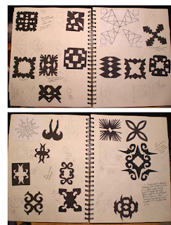
 This is set one of my cut-out shapes. I really enjoyed this, but of course didn't read the directions well! These designs are only 2 inch square. A friend (Cathy) pointed out to me that they should be 4 inches, which was a lot easier!!!!! I scanned them into photshop and enlarged them for later use. The middle design on the right page came apart when I unfolded it. To me this was a very happy accident. I loved the little shape that was created and actually cut another stamp of this design which I used to stamp fabric.
Monday, May 31, 2010
Chapter four, Module One. Black paper cut outs
 This is set one of my cut-out shapes. I really enjoyed this, but of course didn't read the directions well! These designs are only 2 inch square. A friend (Cathy) pointed out to me that they should be 4 inches, which was a lot easier!!!!! I scanned them into photshop and enlarged them for later use. The middle design on the right page came apart when I unfolded it. To me this was a very happy accident. I loved the little shape that was created and actually cut another stamp of this design which I used to stamp fabric.
Labels:
black paper cut outs,
chapter four,
Module one
Thursday, May 20, 2010
Module One, Chapter Three, Sketchbook
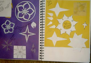 Sketchbook pages showiing design development. Most of these designs were developed with graph paper, tracing paper and photoshop!
Labels:
chapter three,
Module one,
sketchbook
Module One, Chapter Three, Design Sheet C supplement
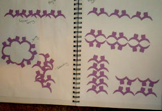 These are some of the repeat patterns from photoshop for Design Sheet C: Pattern with New Design Unit
Labels:
chapter three,
Design sheet c,
Module one
Wednesday, May 19, 2010
Module one, Chapter three, Design sheet C
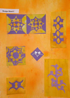 Design Sheet C
I think that it took me some time to warm up to all of this small detail paper cutting. As I started seeing the great designs that could be created by the repeats, it really increased my motivation. I also started using Photoshop more to play with repeats. I could create so many variations in such a short time on the computer, and then develop only the better ideas in paper.
1 and 2) Complex Counter Change
This is one of my favorites!
3, 5, 6, and 7) Pattern with new design unit
I scanned the shape (5) into photoshop and was able to really play with it. I love #7 which is a more free form pattern. This design actually comes from the traditional japanese cherry blossom design.
4) Divide and Seperate This is only so-so.
Labels:
chapter three,
Design sheet c,
Module one
Module One, Chapter Three, Design sheet B
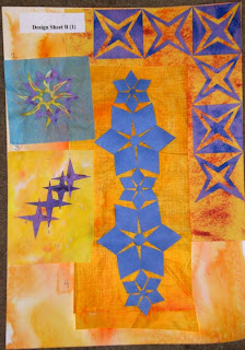
Design Sheet B
Part One
1. Border and Corner For this, I used another one of the counter change designs. I really like the diamond that this is formed where the two blocks meet. I also liked the the way the three star points came together in the corner
2. Linking Two different star shapes. I really like the this spiky yellow star. I don't think the purple star really strengthens the design.
3. Linking border This would make an interesting diagonal border. This design really activates the space around it, despite of its simplicity.
4. Scale I also played around with this design in photoshop. I used the scale variation to accent a curvature to go around a corner.
Design Sheet B, Part 2
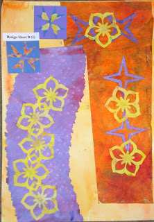
1)New Shape from old: I used a cherry blossom star design and cut it up to creat a different design. It is only so-so.
2) New Shape from old: I liked this one better.
3) Linking two different shapes
4) Linking two different shapes - a variation of the above
5)Linking Borders - I really enjoyed the repetition of the designs in both 4 and 5. In the future chapters, I would like to play with repetition.
Labels:
chapter three,
design Sheet B,
Module one
Module One, Chapter Three, Design Sheet A
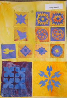 Design Sheet A
1 and 2) Counterchange
3 and 4) Counterchange Although I love this design, it is so traditional that I can't feel that it is "mine".
5 and 6) Symmetry and Asymmetry
7) Circular Star
8) Star in a diamond
9) Star in a Square
10) Star in a Triangle
11) Positive and Negative
12) Repeat Pattern This was an easy one of me. As I work part-time in a quilt store, I understand repeating patterns and the secondary designs that they make. My biggest obsticle was to try and find something fresh and original.
For the repeat pattern, instead of working with paper alone. I scanned my "Star in a Triangle" shape into Photshop and started playing with the different repeats. When I found the one I really liked, I cut paper to create the this design. I pasted some of the repeating designs in my sketchbook for future reference. I might cut a new stamp for this shape and use it on some of the fabric for Chapter 5.
Labels:
chapter three,
Design Sheet A,
Module one
Sunday, May 02, 2010
Module One, Chapter Two, Painted Papers
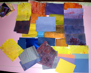 Here is the collection of my painted papers as well as a few of my purchased papers from my stash. I am going for a royal blue/purple and an orange/yellow. I had a hard time getting the right purple. I wanted a blue purple, but the color kept getting too magenta. In the end, I think I created enough blue-purples to work with for the these exercises.
I used spent procion dyes for most of them. I am more comfortable with Golden acrylics so this was nice to try something new. I also tried some brusho powders, but had a hard time getting different color saturation, as they all turned out dark.
One of the orange sheets is actually wonder under (a paper backed fusible webbing) that I painted. Hopefully, I can use it in another part of this chapter. I used a variety of different types of paper: Japanese sumi practice paper, construction paper, newsprint, newspaper, printer paper, handmade paper, and store bought white paper with a grid design built into it.
Labels:
Chapter two,
Module one,
Painted Papers
Module One, Chapter two, Star Points Set Two
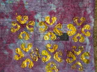
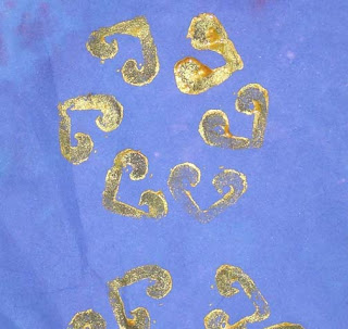
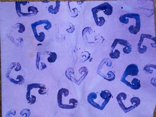
The bottom pattern is truly random stamping. It is okay, but nothing great. The variation in color thickness does not add anything to this design and only distractions and adds "noise", in my opinion, unlike some of my other pages where the variations add to the design.
The middle image is created by working the stamp around a circle. Create this repeating pattern was interesting, but I think it would be more interesting if the design started like this and them moved out, something like the path of a bee?
The top pattern is similar to one that I did in monotones (see other post). I don't like it. I used gold metallic paint mixed with Hansa Yellow. I think that I watered down the paints too much, but I also think that it just looks sloppy. I kept it with the blog to show that not everything works out!
Labels:
Chapter two,
Module one,
Stamped Paper
Module One, Chapter Two, Star Point Set one
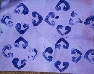
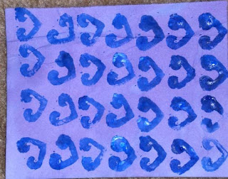
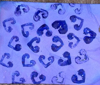
I carved two stamps. I love printmaking so I really enjoyed this part of the chapter. The paint is uneven, but that was really on purpose. I like the variation in line quality. If you would like to see that I really can create "flat" color when printing the images, please let me know. It would not take long.
The top image creates a very nice all over pattern, with wonderful negative spaces formed. Although I really do like this design, I would like to see more complexity. I think it would bore me to stitch it "as is". Possible variations could be: outlining the shapes with contrasting thread, adding complimentary colors instead of making it monochromatic, having ghost imagery in the centers.
The middle design starts off all in a row in the same direction. After a few rows of stamping like this, I started to vary the slant of each row slightly.
The bottom design is created by repeating the shape in an enlarging circular pattern. It has a lot of potential and almost looks like a chrysanthemum.
This is a small stamp at less than 3 cm by 2 cm, but because of its small size there were a lot of choices in creating patterns.
Labels:
Chapter two,
Module one,
Stamped Paper
Module One, Chapter Two,Stamped Paper Set One
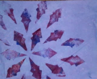
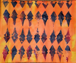
These two sheets were created from the negative space in one of the designs (see worksheet post). Although I like them both, the image on the bottom is such an obvious use of the stamp that it doesn't excite me. The design on the left is a completely different story. I love the pattern that is created. I think the negative space adds to the page, but my favorite part is definitely the colors. When I chose this color theme, this is what I was looking to accomplish. The yellow to Orange works great and by mixing the magenta with the ultramarine blue, the shapes move from red-ish (which integrates the background better) to the blues (orange's compliment) and where they mix to purples (yellow's compliment). All this is happening without the appearance of the overall design becoming too busy or loud.
Labels:
Chapter two,
Module one,
Stamped Paper
Module One, Chapter Two, Worksheets
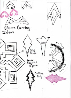
 Here are two different ways that I did my worksheets. Both are directly from my sketchbook. The one on the bottom, contains my notes from my paper painting exercise. It is messy and although I can read it, I am not sure if anyone else would find it that useful. On the top is a page from my sketchbook as I worked up ideas to design my stamps. It is much more controlled and "pretty", but I question, if I could achieve that if I were working fast and messy. There would be times when I would have to work in my sketchbook and then create a notes page/worksheet from these notes. Which is correct or what recommendations on creating the worksheets do you have as I go forward?
Module One, Chapter Two, Stars Cut Outs Three
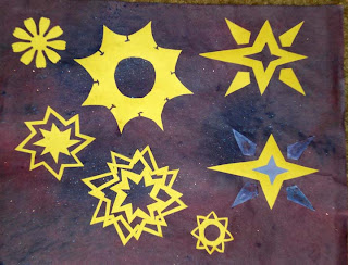 These were actually my first cut outs and to me, the least exciting. The only one that I really find interesting is the one on the lower left, which is three stars layered and at angles to the previous layer. I varied the line thickness for additional interest. It does create some interesting negative shapes inside the stars. The flower star in the upper left corner was created using a cuttle bug and a purchased die cut that I owned. This sheet is also 9 by 12 inches.
Labels:
Chapter two,
Module one,
Paper Cut Outs,
Stars
Module One, Chapter Two, Paper Cut Outs
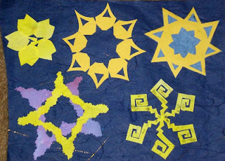 Here is another set of paper cut outs. The background paper is a store bought washi paper with gold threads embedded. It measures 8 inches by 11 inches. I like several of these designs. My least favorite is the upper far right design. It is just too "common" as compared to the others. The cherry blossom on the upper far left seems to be pretty boring, but I think it has such potential, either with color variation or interesting stitching. I would also love to see it three dimensional with stitching. My two favorites are the upper middle one and the lower left designs. Both have lots of potential. The lower left design is just fun and exciting. The lower left design is also done with a pair of fiskar fringe design scissors.
Labels:
Chapter two,
Module one,
Paper Cut Outs,
Stars
Stars Cut Outs, Mod One, Chapter two
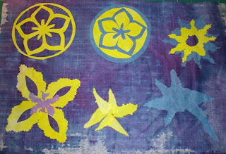 One set of cut out stars is shown here. The top left two are negative images of the same design. I really liked that. The other top design and the bottom far left design were cut with fringed scissors. I layered two papers on top of each other. I really liked the more organic results while still maintaining a clear form. This is in comparison to the two left designs which are from torn paper. I do not like them personally. The foundation paper is 12 inches by 17 inches.
Labels:
Chapter two,
Module one,
Paper Cut Outs
Subscribe to:
Posts (Atom)


