Thursday, November 24, 2016
Module one, Cost
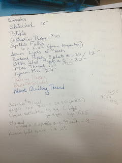
After completing the first module, now I can see where I can improve this for the future. Instead of just putting the cost, I am going to start calculating a unit cost which is a better method for finding a true cost of a piece. For example,I might buy several spools of thread but it would be great to simate how much is being used to cover a four in square heavily versus medium coverage.
Storage
Most of the work in process was kept in my sketchbook. I even attached most of my working samples in there too. Some of my design sheets, composition sheets, and more developed samples were stored in an acid free, archival quality presentation book. This way, if I need to refer back to module one, I can easily reference this work as well as my notes.
While working, my papers were kept in a plastic storage pin. My fabrics were kept in another plastic storage pin. Paints were kept in plastic storage bins by type of medium (acrylic high flow, watercolor, brush, all kept seperate) so they could be quickly accessed but also stored when it was time to move on.
I have two sewing machines which are always kept out and available. One is kept covered with a cloth to keep the dust away when not needed.
All of my dry dyes and chemicals are also kept in a large plastic storage bin that shuts.
Machine threads are kept in plastic cases specifically made for thread storage. They are organized my weight of thread and metallics.
Module one, Time
Module one, Health and Safety conerns
I printed out the above safety instructions years ago. When I would teach dying, I always gave students a link to the print out as well as having a hard copy with me. With this course I reviewed the information. One I no longer found the information quickly n dharma trading website (my source for dyes), but Pro Chem has it and it is Great! I have also now saved it to my cloud account so it is easier to reference when I need it.
Cutting and using rotary cutter. Be mindful when walking with sharp objects- in the middle of the design process my mind is in the clouds and I am not paying attention to where I am walking! Seems simple, but a real issue with me!
When using a rotary cutter, always lock the blade before putting it down. Also, don't lay it down on the cutting board but have a container to hold this type of tools, off the cutting area where it can be covered up quickly.
Using dyes, follow precautions listed on link above. Dyes are safe if you follow basic instructions.
1. Wear a mask when mixing dyes in powder form
2. Mix powder into liquid ti minimizes letting powder become air born.
3. I mix my dyes into concentrate with just the dye and water, I then store these in an extra refrigerator. I wouldn't do this if I had small children. These are also in a set of containers that are different from any I use for food. They are then placed in a larger plastic show box which is placed in the refrigerator. Both the individual bottles and the shoe box all having warning labels in large black letters.
Burning fabric
1. Using a heat gun - Do it outside and still wear a mask! The fumes will make you and family members sick if they inhales it. Also always have some water available; it doesn't have to be a hose, but a bucket of water. If you like to push things just to see what happens eventually something will catch fire! Always try to hold the piece with tongs or tweezers (sometimes I have used a stick), try and work on a glass or metal surface which can't catch fire.
2. Test small piece first. Polyester is my favorite to use as Kunin felt melts beautifully, but I have thought a piece was synthetic but it wasn't and it caught fire! Unless you are 100percent sure, be careful.
Remember the heat gun nozzle gets very hot, be careful where you but it down.
Using the soldering iron
1. Use the same precautions as the heat gun.
Try and use a large box as a spray booth. Take a large box and cut out one of the la get sides and part of the top. It is just a great thing to have ready for when you need it. It isn't a salfety concern as much as a clean up thing. I also cover the bottom with a piece od n newsprint. It can be stored and used for future projects.
Tuesday, November 22, 2016
Module One, Chapter 13, Elly Sienkiewicz

Module One, Chapter 11, Composition Worksheet
Sunday, November 20, 2016
Module One, Chapter 13, Kandinsky
Also in 1911, Kandinsky wrote a book called Concerning the Spiritual in Art. He was studying the “dematerialization” of the object in art and felt that art should represent the spiritual rather than the material and mirrored the music of the time. He began naming his paintings “composition”, Improvisation” and such.
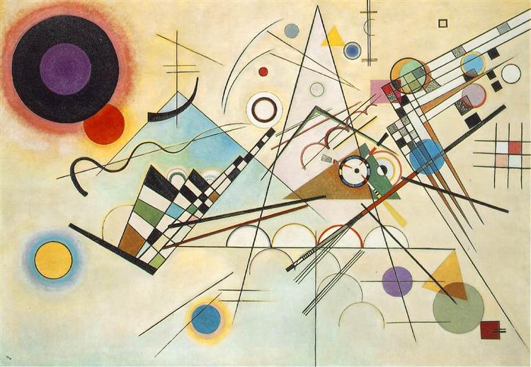
and change with the times. He didn’t try to “say” something in his art, but to make the viewer feel.
Module one, Chapter 13, Herta Puls
Born in Germany in. 19. , Herta Puls originally studied radiography and was a medical technician. She move to England in 1939 where she was introduced to embroidery by Constance Howard. She went on to study both embroidery and textile design as a part time student. She moved to London with her husband and was able to continue her study by passing the Advanced Certificate in embroidery with distinction from the City and Guilds through the London College of Fashion. She was a member of the world famous 62 Z Group. Herta has since passed.
The above is an image from her book.
Herta is best known for her research into the cutwork appliqué of the Kuna Indians, specifically molas.. She began this research in 1969 in the British Museum and the ethnographic museums of Gothenburg and Hamburg. She also made over eight trips to the San Blas islands off the coast of Panama to study this unique application of cutwork and embroidery.

When first examining a mola, the viewer is struck with the beautiful use of vibrant colors. After closer study the complexity of the layers of fabric used to create these pieces can be admired. Herta was not just interested in the techniques which was unique to this area but also in discovering the source of the imagery used. She researched the designs and documented the stages from religious symbols to environmental themes to story-telling.
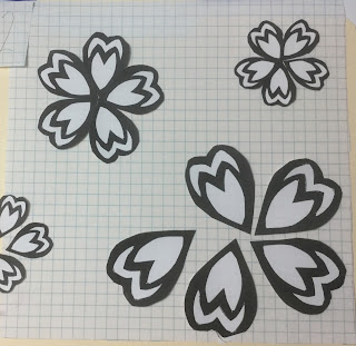
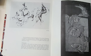 This is from her book. It is one of her drawings and then her cutwork design inspired from the drawing.
Module One, chapter 12, Resolved piece
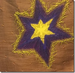
The piece fits with the theme not just through the techniques used, but also with the idea of growth and disintegration. It has been a very trying time in the U.S. this week with the election. While working on this piece, I was able to focus on the cycle of things. Although this is a low period, soon it will shift to a period of hope and growth.
If I were to make it again, I would probably make it larger. Also, I would not have used four elements, in the original design, small petals were floating in the background. As I was putting the resolved piece together, it looked too busy with them.
Saturday, October 29, 2016
Module One, chapter Twelve, paper color
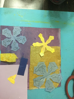
Module One, Chapter Twelve, paper compositions, set two
Module One, Chapter Twelve, paper compositions Set one
Module One, Chapter Eleven, part four
Sunday, June 26, 2016
Module One, Chapter 11 part three,More Fiber
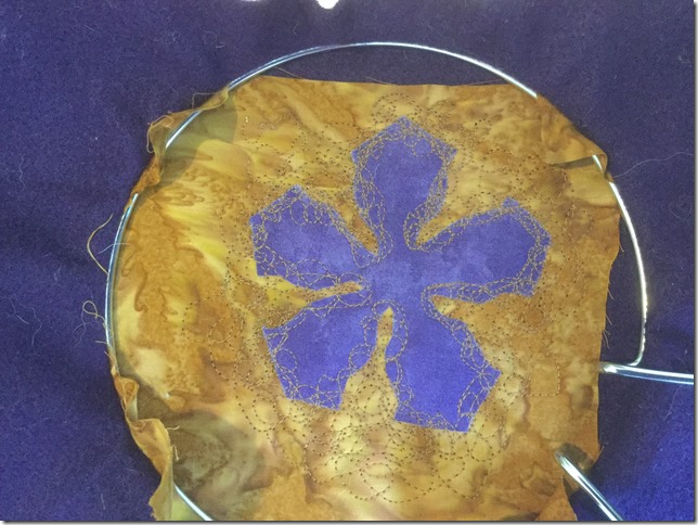
Example 11.18 started with simply fusing the cut out shape onto a cotton *batik”

Different stages of machine stitching were photographed as reference to compare.
Alone, it doesn’t look like disintegration.
This does work well. I was using a new machine and the bobbin tension is not great. I started using a straight stitch, but then changed to a zigzag stitch with the feed dogs lowered. I really liked this.
For example 11.19 below, I tried hand stitching. I started with just a straight stitch trying to go over the edge of the shape. I really didn’t like it and decided I didn’t need to finish a whole shape but just one petal. I then moved to a seed stitch. I didn’t think the dimension of a french knot would not work. The seed stitch was not bad, but it still was not what I was looking for.
I also tried fusing snippets of fabric to the ground in the shape of the star, but it really didn’t have the feel that I was looking for.
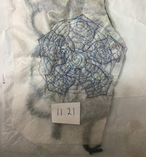
I then tried just machine stitching on to water soluable. I took pictures at different stages to be able to create multiple samples from one.
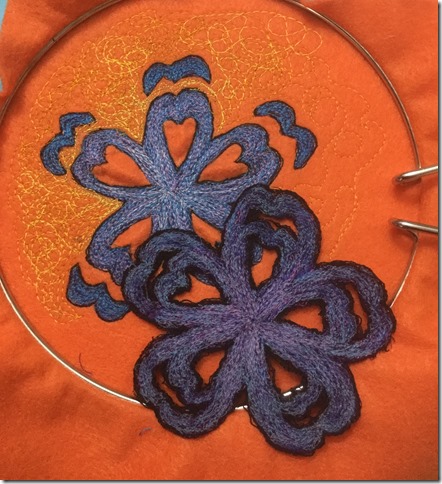
I really think this one had potential but decides to try machining into kunin felt and then using a heat tool to melt the background. I do like it but I think I will machine the background and leave the kunin felt as the middle to distress.
I decided to do one more sample for this “pre” work. I wanted to see if placing yarn on to sticky water soluable, machine stitching through it and cutting into the start shape would both hold some shape but still give the viewer a sense of disintegration. It was okay but not great. It gives me ideas of maybe placing this on top of a cotton of the same shape but slightly askew or doing the background in this technique and then fusing the cotton shape on top and then continue to stitch through it.
Friday, June 24, 2016
Module One, Chapter 11 Fabric and Thread
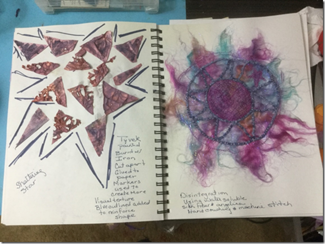
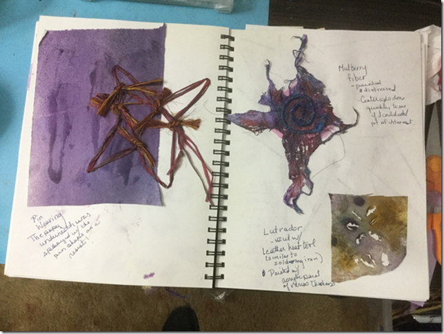
In Image 11.12, I used a pin board to weave a star shape. Image 11.13, I used mulberry fiber which I distressed and painted and 11.14 is with lutrador which I cut with a heat tool Of these three, I like the mulberry fiber, probably because I like creating texture.
In image 11.15, painted tyvek was used and heated with an iron, then cut apart. I added the drawn lines to create more cohesion in the piece. 11.16 is silk fiber and angelina with water soluble. I should have used one of my paper designs as a source, but instead I just wanted to see what it would be. Now I can’t decide if I don’t like it because of the weak design!
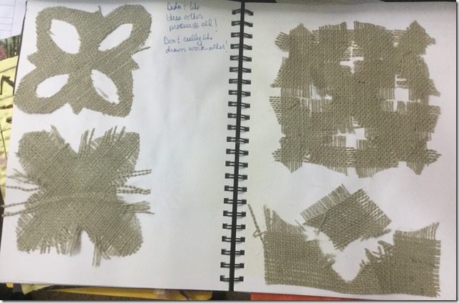
I really didn’t like this exercise, but I am not a huge fan of drawn work either. Really am not using this technique!!!!
Module One, Chapter 11, Paper
These are my exercises to develop my resolved piece. First, I brainstormed ideas of the growth and distintegration of stars in my sketchbook (image one). I also searched new sources of star images. I went through my garden which was full of spring flowers as well as the internet for images to use for inspiration. I decided to focus on not only traditional stars, but also starfish and star shaped flowers.
I then started working on paper designs.
In image 11.1, I used construction paper and a commercial punch and then tried to distress the form. I really didn’t like this as I didn’t feel that it was my design. In image 11.2, I used various ways to distress the paper. My favorites were “wrinkled and sanded” as it had the most texture and cut apart because of the rhythm that can be achieved. In image 11.3, machine stitching was used and then the paper was wet and rubbed and scratched to make holes. To translate this to fabric, I thought of using water soluble, burn away with kunin felt or synthetic organza, or maybe plastic trash bags.
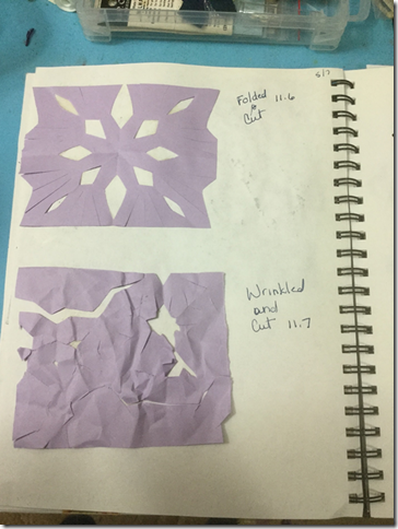
In images 11.6 and 11.7, additional ideas were tried. It was too haphazard for me.
Next I went back to some of my earlier paper designs that I liked and started working with them.
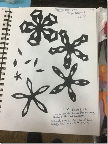
In image 11.8, I started seeing real potential. I like seeing the design change. In the paper exercises, I had really focused on disintegration, but now I began to see growth in the design as well. In image 11.9, I continued with the idea of the design breaking into pieces. I think this one has the strongest use of negative space.
In image 11.10, it helped me focus more on negative space.
Saturday, May 07, 2016
Chapter Ten, optional exercise
Chapter Ten, Ripples
Sunday, April 24, 2016
Chapter nine, module one
This was the multi colored ripple le effect reverse applique.
Chapter nine. Module One, machine reverse applique
