Saturday, October 29, 2016

Module One, Chapter Twelve, paper compositions Set one

I did most of the design work in black and whites.  I wanted to make sure the design was strong on its own before adding color.  After reviewing several basic shapes over the entire module, I focused on two basic shapes that I not only really liked, but that felt that I could illustrate growth and disintegration.
On example one, it was the simplest.

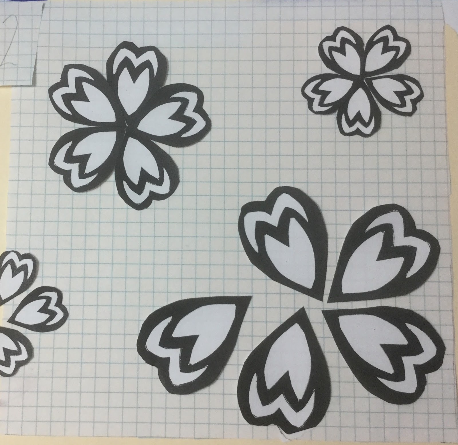
On example two, I let the design move off the page.  I didn't like it, but did like the way the form began to break up.


In example three, I thought about using the disintegration to form a compositional line as well as line density.  The space was too small to develop the line.


In example four, I started liking it better.


No comments: