Last April I attended the fiber forum retreat in Santa Fe. I was juried into the group the year before and have been very excited about attending. Jan Beaney and Jean Littlejohn led the workshop. This piece was created on a piece of fabric that I made from small scraps of sheers that are pieced together with an embellished. For more information about Fiber Forum, check out The Embroidery Guild of America.
Saturday, December 24, 2011
Japanese bead embroidery, phase one
This is phase one of the Japanese bead embroidery. It turns in to glass case. The piece is pretty basic, but turns out nice. The point is to learn the structure of Jen and how it differs from other forms of bead embroidery.
Japanese Bead Embroidery, phase three
I haven't posted in almost a year. I mentioned to someone at work that I had a blog, so I decided that I had better get back to it. I am going to try and post some of the work from the last year. This is my phase three certification project for Japanese Bead embroidery. I plan on staring on phase four in January. This pieces had tons of couched lines (which needed to be straight), but the really fun part of this was the three dimensional aspect of the poppies.
Wednesday, February 23, 2011
Complex Stitched Design Three, Chapter Eight

Layer one: sheer machine stitched down
Layer two: painted wonder under
Layer three: machine stitched grid on Water Soluble
Padded layer of yellow (don't have a clue how it became so lopsided)!!!
Last, I hand stitched to bring out the yellow and to integrate the design. I also have been having computer trouble and no longer have my Photoshop! It was old anyway and needed to be upgraded, but in the meantime, it is hard for me to crop!
Labels:
Chapter Eight,
City and Guilds,
Module one
Complex Stitched Design Two, Chapter Eight

OKAY! I really tried to go complex on this one! I used kunin felt as the base with another layer of kunin felt pressed together using an embellisher. I then "created" a square of fabric with ribbon yarn using water soluble and machine stitching. This was then treated as a layer which is machine stitched down. The yellow layer is then padded with batting. The yellow felt triangles where added last.
Labels:
Chapter Eight,
City and Guilds,
Module one
Complex Stitched Design One, Chapter Eight

I really wanted to start simple with this chapter's assignments. My base layer is only machine stitching. I bourt a new computerized machine the year before and really haven't used the some of the special stitches "muscle" yet. I programmed a stitch size that I thought would be appropriate for the size and density. For the top layer, I purposely choose a computerized stitch what would work with instead of fight the satin fabric's tendency to fray.
Labels:
Chapter Eight,
City and Guilds,
Module one
Stitch Design Six, Chapter Seven

I really wanted to add a fourth layer to one of these samples; however, when it came time to add a top layer, I decided against it.
I used Kunin felt as a base and then my hand dyed purple burlap. The burlap really turned out wonderful and added great texture to the piece. I then added a piece of my stamped fabric on top. I really liked this sample.
Labels:
Chapter Seven,
City and Guilds,
Module one
Monday, July 05, 2010
Japanese Embroidery, Phase Two WIP
Japanese Embroidery, Phase One complete

In April, I started taking Japanese embroidery at the Japanese Embroidery Center here in Atlanta. Most of the people who know me well, didn't think I would last a day. I am not quiet nor a controlled stitcher; however, I know that I am not focused or detailed in my art, which is one of the important parts of Japanese embroidery. I have surprised most people, especially myself, in that I really am enjoying it. It is peaceful stitching.
Coincidentally, I started my City and Guild stitching course during the same month. Both courses are very opposite, with one being all about creating your own designs and learning to think for yourself, while the other is imitate the master for years until you become a master yourself. I think that taking them simultaniously will keep me balanced - well hopefully!
Bead Embroidery

I finished this piece of bead embroidery this weekend. I started it in a class with Sheri Serafini. The structure is her's but the embroidery design is mine. I really wanted to get it finished as I am taking two Japanese bead embroidery classes this month at the Japanese embroidery center here in Atlanta. I can't wait. A master bead embroidery is coming from Japan for a few weeks to teach, so it is a wonderful opportunity!
Monday, June 14, 2010
Monday, June 07, 2010
Stitched Design Three, Chapter Seven

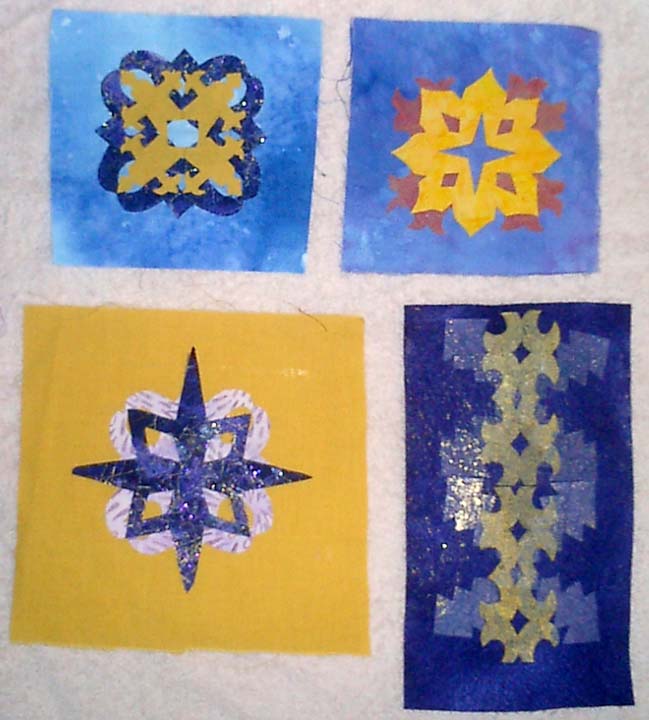
Here is my third stitched sample. It is actually more like 5 by 9 inches as it is doubled. It is on kunin felt with purple commercial fabric and hand dyed (purchased in Japan) muted yellow on top.
Although I thought that I had centered the pattern on the felt, I made a mistake and only left 1/2 inch of felt on one side.
I really like the pattern created by doubling this design. The two together are much stronger than just a single repeat. I used a vanishing/wash away thread to baste again.
On the purple layer I used Splender #5 twisted silk thread. It was a 10 yard package and I barely had enough to finish! I used a chain stitch for a bold outline on the purple which I wrapped with a lighter purple.
Labels:
Chapter Seven,
City and Guilds,
Module one
Stitched Design Two, Chapter Seven

I really started having fun with this piece. I used the fused fabric that had been run under the Embellisher as the bottom layer. I love the texture. I stitched this down with two strands of Splender, a stranded silk in stem stitch with the inside shapes done with backstitch as it wasn't as bulky under the top layer.
I stitched the top layer with a muted lavender linen thread in backstitch. After cutting away, I added buttonhole and french knots in the center of the yellow to pull the purple into the middle and I added the buttonhole on the outside to try and integrate the design with its background. I also added tiny french knots in Sulky gold metallic thread around the "hearts" and then wrapped the outer points with it too.
Labels:
Chapter Seven,
City and Guilds,
Module one
Stitched Design One, Chapter Seven

I wanted to keep the first one on the simple side. I am not great at hand embroidery and so I have decided to really emphasis the hand embroidery on these samples. At the beginning of the exercise, I didn't understand why we were asked to transfer the designs on to the back of the muslim and then baste each layer on the top before stitching. This was is much more accurate with whole cloth cut-away. On the top, I hand basted with cotton thread on the bottom layer and hated pulling those basting threads out. On the top layer, I used YLI Wash Away thread to baste. I still removed most of the basting by hand, but those hard to get bits were dissolved with a wet Q-tip. On the bottom layer, I used a stem stitch and on the top I used a double row of back stitch.
Labels:
Chapter Seven,
City and Guilds,
Module one
Fused Designs, Set Two, Chapter Six

Both of the top two designs use the same fabric. The fused purple and the back of a commercial fabric. The right design is lost with the blue over powering the sheer instead of enhancing each other. The left design was my attempt to move away from a nice design plunked into the middle of a piece of background fabric.
The bottom right design uses painted wonder-under as the bottom layer.
Labels:
chapter Six,
City and Guilds,
Module one
Fused Designs, Set One, Chapter Six

Both designs on the left use the blue fused fabric; however, with the top design, the fabric has been needle-punched with the Embellisher to distress the sheer fabric while the bottom design was not.
The top row right design uses hand-dyed scrim as the bottom layer
The bottom right design was not that strong on an image until it was repeated. The background is an embellished kunin felt with fused tissue paper as the bottom layer. The top layer is the tulle with the painted wonder-under.
Labels:
chapter Six,
City and Guilds,
Module one
Tuesday, June 01, 2010
Module One, Chapter 6, Bonded Fabric
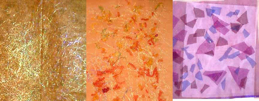
Far left fabric is a sandwich of light blue nylon tulle sprinkled with Bo-nash powder with small scraps from my paper cutting exercises. I didn't like the white spots created when the bonding powder melted so I took some gold foil and foiled the piece too.The right fabric is two pieces of yellow nylon tulle with snippets of dmc stranded thread and gold thread held together with bonding powder.
Middle left piece is painted wonder-under on yellow tulle.
Lower left bonded fabric was created with a bottom layer of commercial purple fabric. On this I ironed some lightly painted wonder-under and then added a layer of snippets of blues and purples, as well as gold thread. I then added more bonding powder as the snippet layer was so thick, and topped it with a piece of nylon sheer. When I actually used this piece in my fused sample and again in my stitched sample, I used the embellisher to distress the sheer and remove the "high gloss".
The far left piece is a commercial print fabric with angelina fused with wonderunder. I then addded a layer of sheer on top.Middle layer is a heavier netting with snippets and covered with tulle.
On the far right, is two layers of sheers with snippets of other sheers sandwiched between them.
Labels:
chapter Six,
City and Guilds,
Module one
Module One, Chapter 5, Painted Fabric Two
Here is a set of my painted fabric. I really like working with tone on tone and realized that the majority of my fabric was orange/yellow on orange/yellow or blue/purple on blue/purple! I made several new fabrics with the compliments. I really liked them.I also experimented with different ways to color the fabric. I came close to using thickened fabric dyes, but decided that it would not be "learning" to use ways that I was most familiar with and so I used several Golden Fluid acrylic paints, Lumerie (another acrylic), Stewart Gill acrylic, and Dye-na-Flow. I really didn't like the Dye-na-Flow as it didn't keep the detail. I also tried Fabrico stamp ink. It advertises as being color fast on fabric. Both of the bottom two fabrics were done with these inks. I think they were not only the easiest to work with but also kept the most defined edges.
Labels:
Chapter Five,
City and Guilds,
Module one
Module One, Chapter Five, Fabric Collection

Here is the beginning of my fabric collection. Most of the cottons I hand dyed for this module. I also dyed cottons, silk, burlap, and stranded floss together. The burlap didn't take the dye well as it had been pre-treated (I bought it off the remnants rack at the fabric store) and has blotches, but these can probably be worked into the design. The upper left piece is a gorgeous woven wool. Since this time, I have shopped for more fabric and purchased yellow, purple and blue tulle (nylon) and several colored nylon sheers.
Labels:
Chapter Five,
City and Guilds,
Module one
Painted Fabric, Set One, Chapter Five

All of these fabrics are cotton and most were some of my own hand dyed fabric. I used fabrico inks and Golden Fluid Acrylics with my stamps. I really liked adding several colors and shapes together.
Labels:
Chapter Five,
City and Guilds,
Module one
Colored Paper Cut Outs Set Two
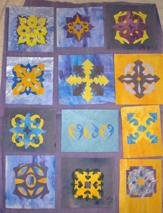
Here is another set of my paired designs. I really do like them. I think the biggest weakness is that there isn't a lot of visual variations between the designs. They are all, except for third row middle, a centered motif, similar to a quilt square. As I develop designs, I really want to find ways to integrate the entire space. On the stitched sample that I worked on this weekend, I began to work with the background more to make it more of a part of the design, not just a pretty pattern slapped onto any old background. Suggestions???
Labels:
chapter four,
City and Guilds,
Module one
Paper Cut Outs Sketchbook one


These are some of th images from my sketchbook for this chapter. I scanned the individual colored shapes into photoshop and manipulate and auditioned the different pairing on my computer. It made it so much easier to see more variations, and a lot faster.
I was also able to play with repetition and the patterns that multiples created. Unfortunatley, I did not have my printer on "contrain proportions" and it skewed them a little. Although I like the original patterns that were created, I also like these too.
Labels:
chapter four,
Colored paper cut outs,
Module one,
sketchbook
Colored Paper Cut Outs Set One

Here is the first design sheet. Each is approximately 4 inch square. I ended up scanning most of the individual colored shapes into Photoshop where I was able to manipulate them on the screen. Because of this, I was able to quickly see lots of different variations and then see what would happen with repeating the pattern. I have included some of the print outs of these manipulations on another post.
Labels:
chapter four,
City and Guilds,
Module one
Black Paper Cut Outs 3, Module One, Chapter Four

Black Paper Cut Outs Set three
I really liked this star shape and wanted to see if there were any good designs that I could make from it. The upper left design was cut from tissue paper. I wanted to see if I could make a more repeat pattern, but couldn't with the thicker black paper that I had on hand.
Labels:
chapter four,
City and Guilds,
Module one
Black Paper Cut Outs 2, Module One, Chapter Four
Black Paper Cut Outs Set Two
These are some of the black paper cut outs. I REALLY enjoyed this exercise and could have spent months just making them. I am glad I finally moved on as the next ones were even better.
Labels:
chapter four,
City and Guilds,
Module one
Monday, May 31, 2010
Chapter four, Module One. Black paper cut outs
This is set one of my cut-out shapes. I really enjoyed this, but of course didn't read the directions well! These designs are only 2 inch square. A friend (Cathy) pointed out to me that they should be 4 inches, which was a lot easier!!!!! I scanned them into photshop and enlarged them for later use. The middle design on the right page came apart when I unfolded it. To me this was a very happy accident. I loved the little shape that was created and actually cut another stamp of this design which I used to stamp fabric.
Labels:
black paper cut outs,
chapter four,
Module one
Thursday, May 20, 2010
Module One, Chapter Three, Sketchbook
Sketchbook pages showiing design development. Most of these designs were developed with graph paper, tracing paper and photoshop!
Labels:
chapter three,
Module one,
sketchbook
Module One, Chapter Three, Design Sheet C supplement
These are some of the repeat patterns from photoshop for Design Sheet C: Pattern with New Design Unit
Labels:
chapter three,
Design sheet c,
Module one
Wednesday, May 19, 2010
Module one, Chapter three, Design sheet C
Design Sheet CI think that it took me some time to warm up to all of this small detail paper cutting. As I started seeing the great designs that could be created by the repeats, it really increased my motivation. I also started using Photoshop more to play with repeats. I could create so many variations in such a short time on the computer, and then develop only the better ideas in paper.
1 and 2) Complex Counter Change
This is one of my favorites!
3, 5, 6, and 7) Pattern with new design unit
I scanned the shape (5) into photoshop and was able to really play with it. I love #7 which is a more free form pattern. This design actually comes from the traditional japanese cherry blossom design.
4) Divide and Seperate This is only so-so.
Labels:
chapter three,
Design sheet c,
Module one
Module One, Chapter Three, Design sheet B

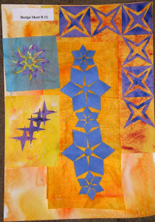
Design Sheet B
Part One
1. Border and Corner For this, I used another one of the counter change designs. I really like the diamond that this is formed where the two blocks meet. I also liked the the way the three star points came together in the corner
2. Linking Two different star shapes. I really like the this spiky yellow star. I don't think the purple star really strengthens the design.
3. Linking border This would make an interesting diagonal border. This design really activates the space around it, despite of its simplicity.
4. Scale I also played around with this design in photoshop. I used the scale variation to accent a curvature to go around a corner.
Design Sheet B, Part 2
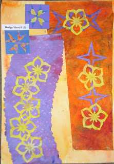
1)New Shape from old: I used a cherry blossom star design and cut it up to creat a different design. It is only so-so.
2) New Shape from old: I liked this one better.
3) Linking two different shapes
4) Linking two different shapes - a variation of the above
5)Linking Borders - I really enjoyed the repetition of the designs in both 4 and 5. In the future chapters, I would like to play with repetition.
Labels:
chapter three,
design Sheet B,
Module one
Module One, Chapter Three, Design Sheet A
Design Sheet A1 and 2) Counterchange
3 and 4) Counterchange Although I love this design, it is so traditional that I can't feel that it is "mine".
5 and 6) Symmetry and Asymmetry
7) Circular Star
8) Star in a diamond
9) Star in a Square
10) Star in a Triangle
11) Positive and Negative
12) Repeat Pattern This was an easy one of me. As I work part-time in a quilt store, I understand repeating patterns and the secondary designs that they make. My biggest obsticle was to try and find something fresh and original.
For the repeat pattern, instead of working with paper alone. I scanned my "Star in a Triangle" shape into Photshop and started playing with the different repeats. When I found the one I really liked, I cut paper to create the this design. I pasted some of the repeating designs in my sketchbook for future reference. I might cut a new stamp for this shape and use it on some of the fabric for Chapter 5.
Labels:
chapter three,
Design Sheet A,
Module one
Sunday, May 02, 2010
Module One, Chapter Two, Painted Papers
Here is the collection of my painted papers as well as a few of my purchased papers from my stash. I am going for a royal blue/purple and an orange/yellow. I had a hard time getting the right purple. I wanted a blue purple, but the color kept getting too magenta. In the end, I think I created enough blue-purples to work with for the these exercises.I used spent procion dyes for most of them. I am more comfortable with Golden acrylics so this was nice to try something new. I also tried some brusho powders, but had a hard time getting different color saturation, as they all turned out dark.
One of the orange sheets is actually wonder under (a paper backed fusible webbing) that I painted. Hopefully, I can use it in another part of this chapter. I used a variety of different types of paper: Japanese sumi practice paper, construction paper, newsprint, newspaper, printer paper, handmade paper, and store bought white paper with a grid design built into it.
Labels:
Chapter two,
Module one,
Painted Papers
Module One, Chapter two, Star Points Set Two


The bottom pattern is truly random stamping. It is okay, but nothing great. The variation in color thickness does not add anything to this design and only distractions and adds "noise", in my opinion, unlike some of my other pages where the variations add to the design.
The middle image is created by working the stamp around a circle. Create this repeating pattern was interesting, but I think it would be more interesting if the design started like this and them moved out, something like the path of a bee?
The top pattern is similar to one that I did in monotones (see other post). I don't like it. I used gold metallic paint mixed with Hansa Yellow. I think that I watered down the paints too much, but I also think that it just looks sloppy. I kept it with the blog to show that not everything works out!
Labels:
Chapter two,
Module one,
Stamped Paper
Module One, Chapter Two, Star Point Set one


I carved two stamps. I love printmaking so I really enjoyed this part of the chapter. The paint is uneven, but that was really on purpose. I like the variation in line quality. If you would like to see that I really can create "flat" color when printing the images, please let me know. It would not take long.
The top image creates a very nice all over pattern, with wonderful negative spaces formed. Although I really do like this design, I would like to see more complexity. I think it would bore me to stitch it "as is". Possible variations could be: outlining the shapes with contrasting thread, adding complimentary colors instead of making it monochromatic, having ghost imagery in the centers.
The middle design starts off all in a row in the same direction. After a few rows of stamping like this, I started to vary the slant of each row slightly.
The bottom design is created by repeating the shape in an enlarging circular pattern. It has a lot of potential and almost looks like a chrysanthemum.
This is a small stamp at less than 3 cm by 2 cm, but because of its small size there were a lot of choices in creating patterns.
Labels:
Chapter two,
Module one,
Stamped Paper
Module One, Chapter Two,Stamped Paper Set One


These two sheets were created from the negative space in one of the designs (see worksheet post). Although I like them both, the image on the bottom is such an obvious use of the stamp that it doesn't excite me. The design on the left is a completely different story. I love the pattern that is created. I think the negative space adds to the page, but my favorite part is definitely the colors. When I chose this color theme, this is what I was looking to accomplish. The yellow to Orange works great and by mixing the magenta with the ultramarine blue, the shapes move from red-ish (which integrates the background better) to the blues (orange's compliment) and where they mix to purples (yellow's compliment). All this is happening without the appearance of the overall design becoming too busy or loud.
Labels:
Chapter two,
Module one,
Stamped Paper
Module One, Chapter Two, Worksheets

Here are two different ways that I did my worksheets. Both are directly from my sketchbook. The one on the bottom, contains my notes from my paper painting exercise. It is messy and although I can read it, I am not sure if anyone else would find it that useful. On the top is a page from my sketchbook as I worked up ideas to design my stamps. It is much more controlled and "pretty", but I question, if I could achieve that if I were working fast and messy. There would be times when I would have to work in my sketchbook and then create a notes page/worksheet from these notes. Which is correct or what recommendations on creating the worksheets do you have as I go forward?Module One, Chapter Two, Stars Cut Outs Three
These were actually my first cut outs and to me, the least exciting. The only one that I really find interesting is the one on the lower left, which is three stars layered and at angles to the previous layer. I varied the line thickness for additional interest. It does create some interesting negative shapes inside the stars. The flower star in the upper left corner was created using a cuttle bug and a purchased die cut that I owned. This sheet is also 9 by 12 inches.
Labels:
Chapter two,
Module one,
Paper Cut Outs,
Stars
Subscribe to:
Posts (Atom)