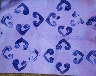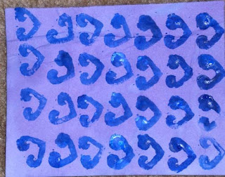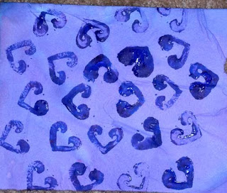


I carved two stamps. I love printmaking so I really enjoyed this part of the chapter. The paint is uneven, but that was really on purpose. I like the variation in line quality. If you would like to see that I really can create "flat" color when printing the images, please let me know. It would not take long.
The top image creates a very nice all over pattern, with wonderful negative spaces formed. Although I really do like this design, I would like to see more complexity. I think it would bore me to stitch it "as is". Possible variations could be: outlining the shapes with contrasting thread, adding complimentary colors instead of making it monochromatic, having ghost imagery in the centers.
The middle design starts off all in a row in the same direction. After a few rows of stamping like this, I started to vary the slant of each row slightly.
The bottom design is created by repeating the shape in an enlarging circular pattern. It has a lot of potential and almost looks like a chrysanthemum.
This is a small stamp at less than 3 cm by 2 cm, but because of its small size there were a lot of choices in creating patterns.
No comments:
Post a Comment