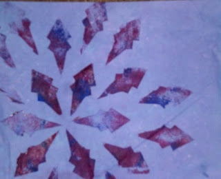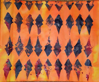

These two sheets were created from the negative space in one of the designs (see worksheet post). Although I like them both, the image on the bottom is such an obvious use of the stamp that it doesn't excite me. The design on the left is a completely different story. I love the pattern that is created. I think the negative space adds to the page, but my favorite part is definitely the colors. When I chose this color theme, this is what I was looking to accomplish. The yellow to Orange works great and by mixing the magenta with the ultramarine blue, the shapes move from red-ish (which integrates the background better) to the blues (orange's compliment) and where they mix to purples (yellow's compliment). All this is happening without the appearance of the overall design becoming too busy or loud.
No comments:
Post a Comment