
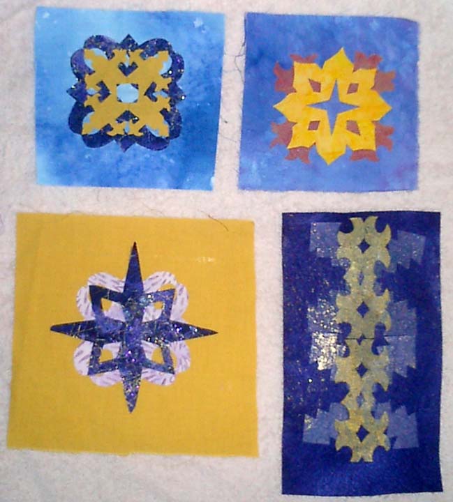
Here is the beginning of Phase Two for my Japanese embroidery class. I love this design. Soon I will be working with more goldwork which is gorgeous!!!!


 Far left fabric is a sandwich of light blue nylon tulle sprinkled with Bo-nash powder with small scraps from my paper cutting exercises. I didn't like the white spots created when the bonding powder melted so I took some gold foil and foiled the piece too.
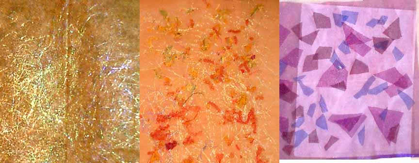 The far left piece is a commercial print fabric with angelina fused with wonderunder. I then addded a layer of sheer on top.
 Here is a set of my painted fabric. I really like working with tone on tone and realized that the majority of my fabric was orange/yellow on orange/yellow or blue/purple on blue/purple! I made several new fabrics with the compliments. I really liked them.

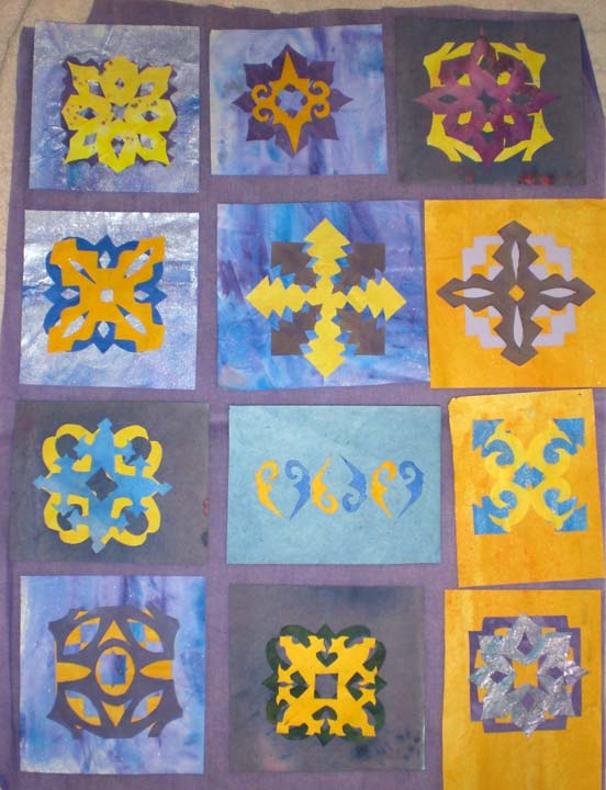 Here is another set of my paired designs. I really do like them. I think the biggest weakness is that there isn't a lot of visual variations between the designs. They are all, except for third row middle, a centered motif, similar to a quilt square. As I develop designs, I really want to find ways to integrate the entire space. On the stitched sample that I worked on this weekend, I began to work with the background more to make it more of a part of the design, not just a pretty pattern slapped onto any old background. Suggestions???


 This is set one of my cut-out shapes. I really enjoyed this, but of course didn't read the directions well! These designs are only 2 inch square. A friend (Cathy) pointed out to me that they should be 4 inches, which was a lot easier!!!!! I scanned them into photshop and enlarged them for later use. The middle design on the right page came apart when I unfolded it. To me this was a very happy accident. I loved the little shape that was created and actually cut another stamp of this design which I used to stamp fabric.
 Sketchbook pages showiing design development. Most of these designs were developed with graph paper, tracing paper and photoshop!


