Sunday, June 26, 2016

Module One, Chapter 11 part three,More Fiber

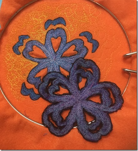
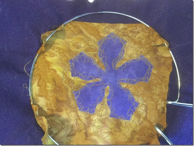
Example 11.18 started with simply fusing the cut out shape onto a cotton *batik”

File_000

Different stages of machine stitching were photographed as reference to compare.

File_000 (1)

Alone, it doesn’t look like disintegration.

File_000 (4)

This does work well.  I was using a new machine and the bobbin tension is not great.  I started using a straight stitch, but then changed to a zigzag stitch with the feed dogs lowered.  I really liked this.

For example 11.19 below, I tried hand stitching.  I started with just a straight stitch trying to go over the edge of the shape.  I really didn’t like it and decided I didn’t need to finish a whole shape but just one petal.  I then moved to a seed stitch.  I didn’t think the dimension of a french knot would not work.  The seed stitch was not bad, but it still was not what I was looking for.

File_000 (6)

I also tried fusing snippets of fabric to the ground in the shape of the star, but it really didn’t have the feel that I was looking for.

I then tried just machine stitching on to water soluable.  I took pictures at different stages to be able to create multiple samples from one.

File_000 (9)

File_000 (8)

File_000 (7)Image 11.20

I really think this one had potential but decides to try machining into kunin felt and then using a heat tool to melt the background.  I do like it but I think I will machine the background and leave the kunin felt as the middle to distress.

File_000 (10)

File_000 (11)

I decided to do one more sample for this “pre” work.  I wanted to see if placing yarn on to sticky water soluable, machine stitching through it and cutting into the start shape would both hold some shape but still give the viewer a sense of disintegration.  It was okay but not great.  It gives me ideas of maybe placing this on top of a cotton of the same shape but slightly askew or doing the background in this technique and then fusing the cotton shape on top and then continue to stitch through it.
File_000 (12)

Friday, June 24, 2016

Module One, Chapter 11 Fabric and Thread

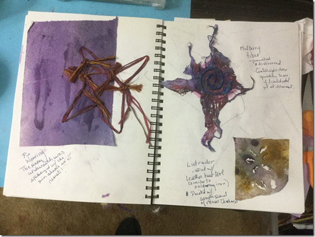
In Image 11.12, I used a pin board to weave a star shape. Image 11.13, I used mulberry fiber which I distressed and painted and 11.14 is with lutrador which I cut with a heat tool  Of these three, I like the mulberry fiber, probably because I like creating texture.

image

image

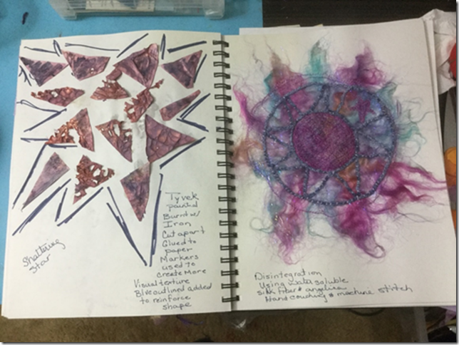
In image 11.15, painted tyvek was used and heated with an iron, then cut apart.  I added the drawn lines to create more cohesion in the piece.  11.16 is silk fiber and angelina with water soluble.  I should have used one of my paper designs as a source, but instead I just wanted to see what it would be.  Now I can’t decide if I don’t like it because of the weak design!

FullSizeRender (3)

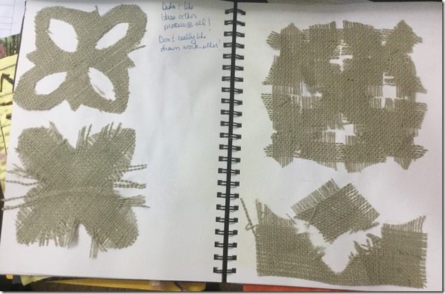
I really didn’t like this exercise, but I am not a huge fan of drawn work either.  Really am not using this technique!!!!

Module One, Chapter 11, Paper

These are my exercises to develop my resolved piece.  First, I brainstormed ideas of the growth and distintegration of stars in my sketchbook (image one).  I also searched new sources of star images.  I went through my garden which was full of spring flowers as well as the internet for images to use for inspiration.  I decided to focus on not only traditional stars, but also starfish and star shaped flowers.

FullSizeRenderImage ONE

I then started working on paper designs.

image

In image 11.1, I used construction paper and a commercial punch and then tried to distress the form.  I really didn’t like this as I didn’t feel that it was my design.  In image 11.2, I used various ways to distress the paper.  My favorites were “wrinkled and sanded” as it had the most texture and cut apart because of the rhythm that can be achieved.  In image 11.3, machine stitching was used and then the paper was wet and rubbed and scratched to make holes.  To translate this to fabric, I thought of using water soluble, burn away with kunin felt or synthetic organza, or maybe plastic trash bags.

image

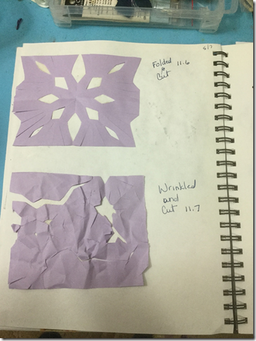
In images 11.6 and 11.7, additional ideas were tried.  It was too haphazard for me.

Next I went back to some of my earlier paper designs that I liked and started working with them.

image

image

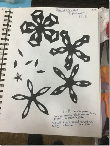
In image 11.8, I started seeing real potential.  I like seeing the design change.  In the paper exercises, I had really focused on disintegration, but now I began to see growth in the design as well.  In image 11.9, I continued with the idea of the design breaking into pieces.  I think this one has the strongest use of negative space.

image

In image 11.10, it helped me focus more on negative space.