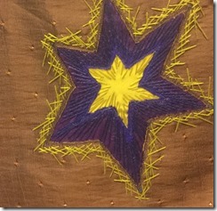
This was the multi colored ripple le effect reverse applique.
Sunday, April 24, 2016
Chapter nine, module one
Chapter nine. Module One, machine reverse applique

Chapter Nine, Module one, Reverse Applique

I am finally back working on my City and Guilds course with Sian Martin after several years. I am determined to finish this by the end of next year by creating self-imposed deadlines. I spent most of last week reacquainting myself with the earlier assignments and finding all the pieces that I had completed.
Here is my sampling of reverse hand applique. I really expected this to be easy as I have done several applique quilts including a twenty block Baltimore album quilt. My first mistake was not counting the number of layers that I would need. I had thought to use the mustard yellow loose woven cotton as the base layer. I knew it would be hard to applique, and it was. I added the satin fabric to the back and did the best I could. I used the blue chain stitch to camouflage the raveling seam to some extent. The backstitch was used to emphasize the stronger outer lines. The stars in the background was to create a more interesting background without taking away from the primary design element